AKA Monica Rocha
I’m a Brand & Web Designer who works with filmmakers and social impact groups struggling with low visibility and missed opportunities by crafting strategic, cinematic websites that elevate their work, impress funders/ collaborators, and streamline their pitch so they can focus on storytelling and scaling their practice.
I also have 7+ years experience working with lifestyle, finance, and ecomm brands.
Instagram ︎︎︎
Dribbble ︎︎︎
LinkedIn ︎︎︎
Filmmakers Needed for Website Design Research
Instagram ︎︎︎
Dribbble ︎︎︎
LinkedIn ︎︎︎
Filmmakers Needed for Website Design Research

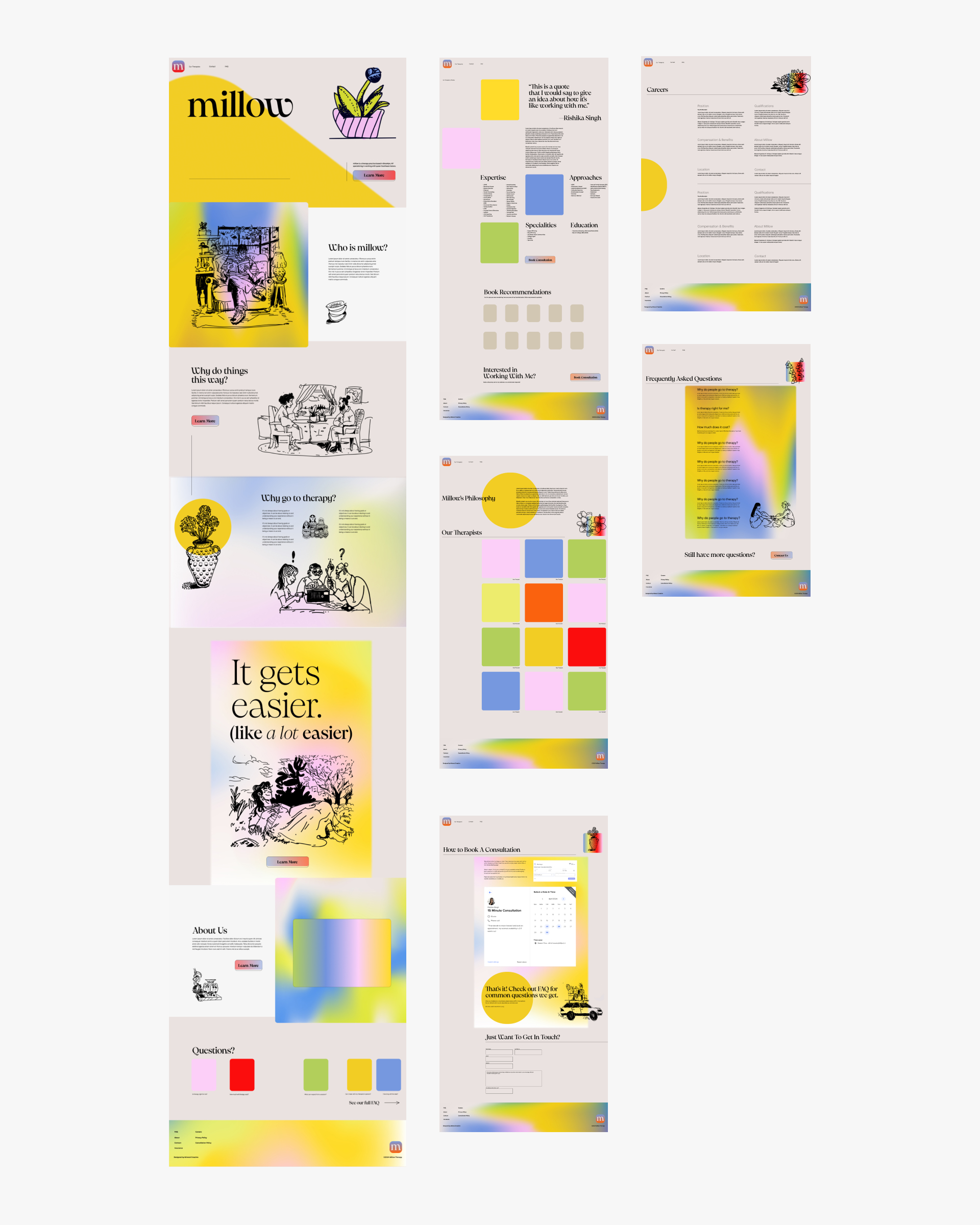
A playful brand and website for a culturally-specific therapy practice.
Role: Web Designer, Illustrator, Brand Designer, Project Manager
Team: Solo Project
Tools: Figma, Sketch, HTML/CSS/Javascript

Context
This project came from Rishika Singh, a queer Indian therapist and lifelong New Yorker. We met in March 2024 and embarked on the project to create a brand for her new practice millow therapy, which she hopes will “bring the kind of therapy I found deeply healing to my own community, whose unique perspectives and challenges are rarely centered in traditional therapy practice”.
Brief
In light of the minimal aesthetic that many therapy practices employ, we were looking to represent millow in way that’s relational, candid, and warm, with a full-bodied, earthy aesthetic to match. Additionally, many therapists spend more time than needed on clients that aren’t a good fit, and the process of making an appointment, consulting, going through insurance, and doing intake can be a lot to go through all to figure out that the client wasn’t properly educated on what they needed out of therapy. This is especially important for a culturally specific therapy practice like millow.
Check it out at millowtherapy.com!


Moodboards
I came up with three possible directions for millow therapy. We agreed on a mood inspired by ceramic glazes, sculptural shapes, and a bold and friendly illustration, mixed with the color palette of another direction.
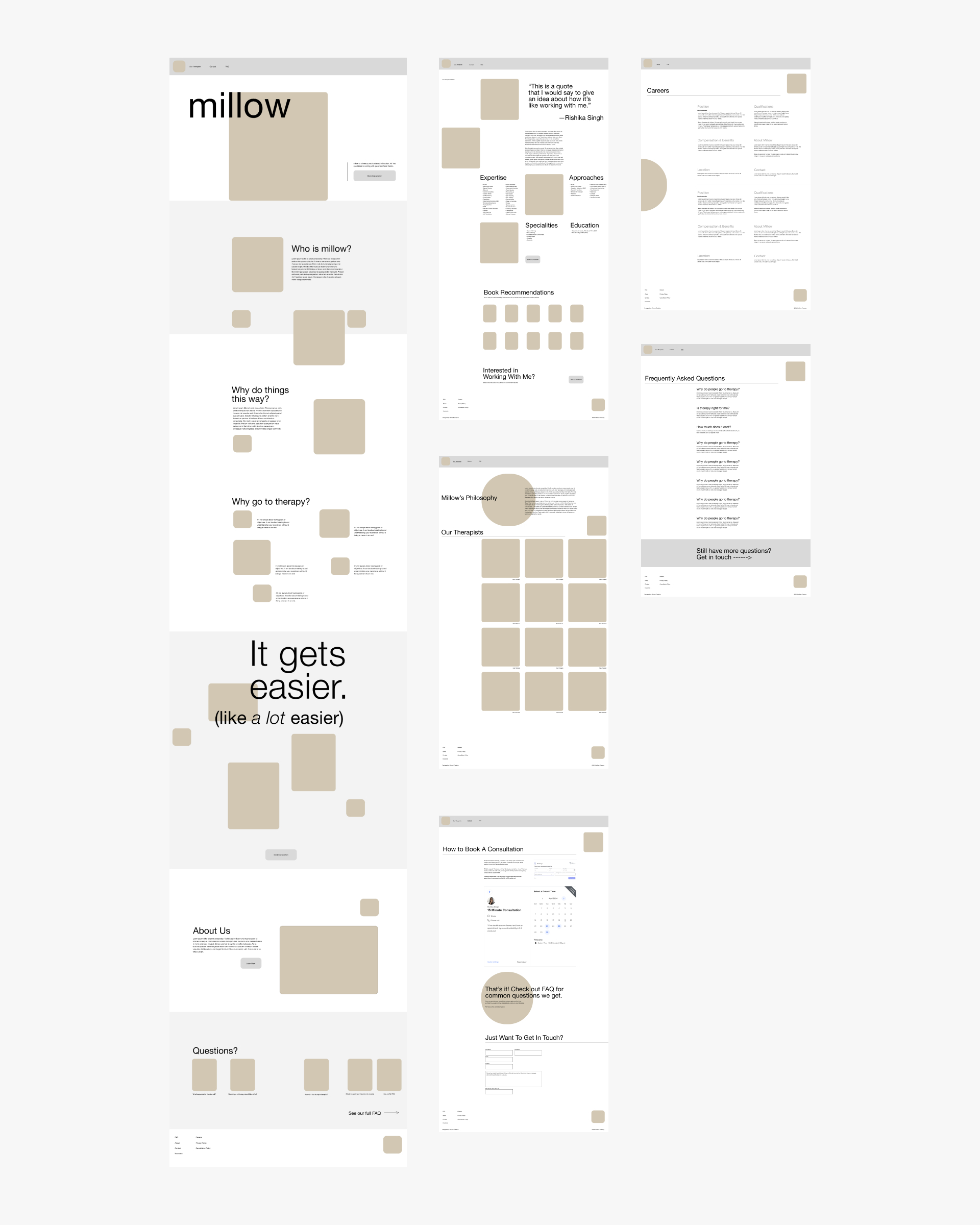
 Wireframes
The homepage was conceived as a one-page flow that would take the visitor to Learn More before giving an option to book a consultation. It was important that they had looked through the FAQ or at least the end of the homepage before they were led to make an appointment.
 Final Designs
In the final design, I blended the typography, illustration, and graphic elements. I made a “glaze” with the color palette for each section and some images. I choose Pangaia as the main font and National Park, a font designed after US National Park signage, as the secondary font. For the illustration, I focused on chunky shapes and dot shading influenced by henna tattoos and traditional South Asian jewelry.


 .
. 
